Monday, September 30, 2013

Elements of Art and Principles of Design


Elements Of Art


Line- Lines are marks made by a pointed tool: brush, pencil, pen, etc. Lines can vary in width, direction, curvature, length, or color.
I chose this photograph for LINE because you can clearly see lines from the floor, curved and straight lines.
 
I chose this painting because you can see that almost everything is done with LINE, like the tall sculpts of rock.


Shape- Shapes are formed wherever the ends of a continuous line meet.Geometric shapes such as circles, triangles or squares have perfect, uniform measurements and don't often appear in nature. Organic shapes are associated with things from the natural world, like plants and animals.
I chose this photograph to represent SHAPE because you can see the geometric shape of a leaf, a continuous line.
I chose this painting because you can see the geometric SHAPE of the cans.  


Color- Color wheels show the primary colors, secondary colors, and the tertiary (intermediate) colors. They also show the relationships between complementary colors across from each other, such as blue and orange; and analogous (similar or related) colors next to each other such as yellow, green, and blue. Black and white may be thought of as colors but, in fact, they are not. White light is the presence of all color; black is the absence of reflected light and therefore the absence of color.
I chose this photo for COLOR because you can obviously see color, it has the presence of warm and cool colors.
I chose this painting to represent COLOR because everything is has color, blue, yellow, green, red, and black, it contains most of the colors.


Value (Tone)- Value, or tone, refers to dark and light; the value scale refers to black and white with all gradations of gray in between. Value contrasts help us to see and understand a two-dimensional work of art.
I chose this photograph to show VALUE because of the different shades of black, you can see the color going from dark to light.
I chose this painting to show VALUE because its easy to see the color going from black to a lighter shade of black and gray.

Form- Form describes objects that are three-dimensional, having length, width, and height.
I chose this photograph to represent FORM because you can see that the squares are 3D, you can tell it has a length, width and height.
I chose this painting for FORM because you can see both man look like 3D.


Texture- Texture can be rough, bumpy, slick, scratchy, smooth, silky, soft, prickly--the list is endless. Texture refers to the surface quality, both simulated and actual, of artwork.
I chose this photograph for TEXTURE because when you look at it, you can imagine how the bark feels, you can feel the texture.
I chose this painting for TEXTURE because you can see the grass and almost feel the texture  of ir.


Space- Space refers to distances or areas around, between, or within components of a piece. Space can be positive (white or light) or negative (black or dark), open or closed,shallow or deep, and two-dimensional or three-dimensional.
I chose this photo to show SPACE because you can see the straws been surrounded by negative(dark&black) shadows.
I chose this painting to represent PAINTING because the woman is surrounded by negative(black) space.


Balance-
Balance is the comfortable or pleasing arrangement of things in art. There are three different types of balance: symmetrical, asymmetrical, and radial
.
I chose this photo for Balance because if you were to cut this photo in half it would be equal in both sides.
I chose this painting to show Balance because the total weight of the picture if balance.


Contrast-Contrast is created by using elements that conflict with one another. Often, contrast is created using complementary colors or extremely light and dark values. Contrast creates interest in a piece and often draws the eye to certain areas. It is used to make a painting look interesting.
I chose this photo to represent Contrast because the color of the green wall and the yellow dress conflict each other.It draws you attention to the little girl.
In this painting you attention is drawn to the flowers shown with color compare to thet guy in black and white thats holding the flowers.


Emphasis-Emphasis in the focal area of an artwork gives it importance. An artist may stress some elements of the design over others. The eye of the viewer will focus on the area of emphasis or center of interest first, then take in the rest of the composition.

I chose this photograph for Emphasis because the focal area is the red door, then your focus goes around the rest of the composition.
This painting shows Emphasis. The viewers attention is focused in the police man and the kid, then the attention goes to the rest of the painting.


Movement- Movement in an artwork means the artist is taking viewers on a trip through the work by means of lines, edges, shapes, and colors often leading to the focal area. Movement is a visual flow through the composition. It can be the suggestion of motion in a design as you move from object to object by way of placement and position. Directional movement can be created with a value pattern. It is with the placement of dark and light areas that you can move your attention through the format.
This photo represents Movement. The photo shows different dark and light areas that gets your attention throughout the whole thing.
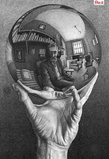
Movement is presented here because the "head" shape repeated makes the viewers attention evaluate the whole painting.

Pattern- Patterns are made in art when the same shapes or elements are repeated again and again. Pattern uses the elements of art in planned or random repetitions to enhance surfaces of paintings or sculptures.
You can see Pattern in this photo, the yellow signs are been repeated.
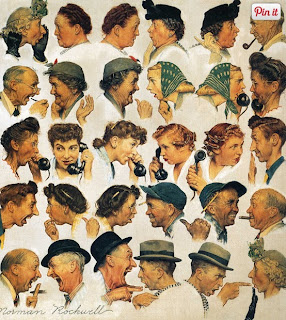
This painting shows Pattern, the same people are been repeated over & over the painting. 

Rhythm-RRhythm is the repetition of shapes, lines, and forms. Rhythm is a movement in which some elements recurs regularly. Like a dance, it will have a flow of objects that will seem to be like the beat of music.
This photo shows Rhythm, the repetition of the circle form and the lines of the mushrooms. 
This shows Rhythm by repeating the square tiles, the statues, an lines on top of the painting.


Unity- Unity means that all elements in an artwork are in harmony. Unity brings together a composition with similar units.
This photo shows unity because the photo uses the same type of units.
This painting shows unity by having the same types of lines, the whole artwork is in harmony.

Mergers

I chose this picture to represent, Avoiding Mergers because the guy on the left side is half cut, most of the attention goes  to the truck rather that the two guys working.

Thursday, September 26, 2013

Lines

                               In this photo you can see the lines of the sun rays, they're diagonal leading towards the people been aided by other.

Framing


                                             This photo shows Framing because you can see the sides of the window making a frame for the outside scene where there an ambulance.

Balance

 
     In this photo you can see three buildings that are almost equally separated, you can see the balance because all the attention is distributed all through the photo.

Rule of Thirds

The man falling down one of the towers is not placed exactly in the middle of the photo which makes it fit into the Rule of Thirds, he is placed on the top middle square of the photo.


Simplicity

        This photo fits for Simplicity because the background is all one color(blue) there is no distraction, you attention is directed to the building.

Friday, September 20, 2013

Photo Manipulation and Ethics

1. This story focuses on the ethical view of the way  some photographers manipulate their photos. Many important photographers have done it and many of them have lost their jobs because of it. In the Middle East this happens very often, an example of photo manipulation is the Iran missile test launch in July 2008. This was done by the media branch of Iran's Revolutionary Guards, during the missile test one of the missile fail to fire so they duplicated one of the other three missiles and release the picture.

2. I don't think this photo editing is acceptable in some cases, I think photographer should always say the truth in their photos because we don't like to be given the wrong information on purpose. They might be exceptions were a photographer can edit the photo but no in an exaggerated way or to completely change it.

1A.
I think this manipulated photo is the most unethical from the rest of the photos because during the meeting of Clinton and Castro there was not a photographer and they completely made a new image. No one knows that Clinton was that happy to see a men like Fidel Castro who was a communist president.
I consider this the least unethical photo, I think is not that bad to alter just a little just to make it fit into the magazine cover. 

Wednesday, September 18, 2013

Post Shooting Reflection

http://miaphotojblog.blogspot.com/

1. Two things I liked about her photos were that she did good with the lighting, and how she zoom in into the red car.


2. One thing she needs to improve on is that when she takes a picture on glass, she needs to check that her reflection doesn't show.

40 Greatest Photos Ever

The reason I chose this photo is because it just grabbed my attention, what I liked is that the photographer did a early good job zooming in into the mens face, all you can focused was the expression of his face, every single detail. Everything behind the soldier is blurred outs thats what makes you focus on his face. I believe that what made this photo one of the top 40 is that it has a lot of emotion and everything is perfect, the lighting especially.

 I chose this photo also because its really beautiful. This baby was rescued from a Tsunami disaster, and also your eyes are drawn all around the photo which makes it balance.The lighting is very good its bright.
I picked this photo because is catchy, also the light fits with the mood of what was happening( men died suddenly waiting for the train, monk was praying) It also captures the peoples' reaction, but all the focus is directed to the men and mon.

National Geographic warm-up

1.Eruption of the Cordon del Caulle.
2.This is my favorite photo of the 45 photos because I think its really impressive capturing this scene from nature. The light is perfect and I like how you can see the sky filled with stars, the eruption, and lightning on to of the cloud. Then at the bottom of the picture is all black but you can still see the trees and land.

3.I would take a picture of something related with nature, not sure of what exactly but something that is very rare to see.

Monday, September 16, 2013

Great black and white photographers, Part 2

                                                              HELEN LEVITT


-Helen Levitt, was born on August 31, 1913, in Brooklyn, New York.

-Levitt died on March 29, 2009 in New York, New York.

-She pursued the career of photography and she was know for her captures of children and urban street life. 

- She wanted to be an artist but had no talent, and didn't even know how to draw so she left high school, and just out of high school Levitt got a job in a photography studio 

-She had her first major exhibition that took place in 1943 at the Museum of Modern Art (New York)

-In 1965 she published her first major collection, A Way of Seeing.


Happy

HAPPY

Metal

METAL

Red

RED

Thursday, September 12, 2013

Camera Parts

APERTURE-Aperture is the size of the opening in the lens when a picture is taken.


SHUTTER-A device that opens and closes to expose the film in a camera.

  1.  


EXPOSURE-The quantity of light or other radiation reaching a photographic film, as determined bye the shutter speed and lens aperture.


DEPTH OF FIELD-The distance between the nearest and the furthest objects that give an image judged to be in focus in a camera.


F-STOP-It is a dimensionless number that is a quantitative measure of lens speed. 


FOCAL LENGHT- The distance between the center of a lens or curved mirror and its focus.


1. Camera Dial, is used to change the camera mode of shutting.
It has this different modes that you can choose to use-
  • Manual modes: Manual (M), Program (P), Shutter priority (S), Aperture priority (A).
  • Automatic modes: Auto, Action, Portrait, Night portrait, Landscape, Macro.


2. Flash Button, is used for taking pictures where there is low light, it brightens the picture. You can put it in auto-mode, disable-flah, forced-flash, and finally slow-flash.

3. Erase Button is use for deleting pictures.

4.Body Cap, is use to protect the camera lens.

5.Power Button is use to turn on and off the camera, its located at the top of the camera.

Tuesday, September 10, 2013

Camera History


1. The "Camera Obscura" was created when ancient philosophers discovered an optical effect, when in a dark room there was a small hole that focused light and was reflected on the opposite wall upside-down.  

2.The step that made closer way to getting the modern camera was when Isaac Newton and Christian Huygens perfected their understanding of optics and the process of making high quality glass lends.

3.The first camera parts invented by Niepce were the glass lends,a dark box, and a film.

4.They both have the same steps, light passes through the lens, into the camera, and exposes the film and you finally get a photograph.

5. This is what digital cameras use to capture an image, photographs are stored on reusable computer memory devices.

6. The difference between a Auto Mode and Program mode is that in program mode you can adjust the  flash and few other camera settings.

7.The portrait mode is used to attempt to blur out the background. The camera will try to use the fastest available lends setting.

8. The sport mode is used to  freeze motion, the camera will use the highest shutter speed possible.

9. You should do the half press on the rigger button because it is easier,thee camera will attempt to lock focus on the subject and the focus lock allows the photographer to freeze the point of focus before taking the picture.

10.That symbol means there is no flash.

11. This symbol means that the camera will fire if it thinks it needs more light.

12. If there is too much light, the picture will be wasted.

13. I there is not enough light then the picture will be too dark.

14. "Stop" means that there is a relative change in the brightness of the light.

15. It would be 4 stops brighter.

16. It would be 16 stops brighter.

17. For longer shutter speed you get more light.

18. For shorter shutter speed you get less light.

19. The aperture controls how much light goes in the camera.

20. To increase the amount of light the aperture has to be more open.

Wednesday, September 4, 2013

Worst and Best

For me this is the worst of the five pictures I took. What I believe that made it not a good picture is that it was kind off blurry and she had just turn around and there's too much space left that drags the attention more to the hall than to her.
                                                     This is the best picture I took, the position she was in going up the stairs drags all the attention to her. I also like the light, and it wasn't blurry and she also has a really good pose for the camera. This are the were the reason why I chose this as my best picture.